Node
The node configuration section controls the visual appearance of the nodes, including the size and shape of the nodes, the font used to draw the node text and so forth.
Common properties
The properties below are common to all node styles so they are listed only once in this section.
Text properties
- fontName
- Type
- String
- Default
- “Gill Sans”
Name of the font to draw the node text with. Normal font weights are always used.
Note
The font name is usually not portable across different operating system and graphics backend combinations and it might need to be adjusted for each platform. Different graphics backends and operating systems may resolve font names differently, for example the font name “Helvetica” might result in a different font being picked up by NodeBox on Mac OS X than the by the command line application on Windows using the Cairo backend.
- lineHeight
- Type
- Number
- Values
- >0.0
- Default
- 1.3
Line height of the node text expressed as a multiplier of the font size.
- textAlign
- Type
- Enum
- Values
- left, right, center, justify, auto
- Default
- auto
Alignment of the text within the node shape. The value auto aligns the text left or right depending on the node’s orientation in relation to its parent and centers the text in the root node.
- justifyMinLines
- Type
- Number
- Values
- >0
- Default
- 5
If textAlign is set to justify, this property specifies the minimum number of lines for the full justification to take effect. If the total number of lines is below this value, the text will be centered instead.
- hyphenate
- Type
- Boolean
- Default
- yes
Controls whether the node text should be hyphenated if it spans multiple lines.
Note
Hyphenation is supported for English text only.
- maxTextWidth
- Type
- Number
- Values
- >0.0
- Default
- 240.0
Maximum width of the node text. If the whole text cannot fit into a single line of this width, the text will be broken into multiple lines and it will be aligned according to the value of the textAlign property.
- textPadX
- Type
- Number
- Values
- >0.0
- Default
- fontSize * 1.0
Horizontal padding between the bounding rectangle of the node text and the node shape. It is recommended to set this value proportional to the font size.
- textPadY
- Type
- Number
- Values
- >0.0
- Default
- fontSize * 0.45
Vertical padding between the bounding rectangle of the node text and the node shape. It is recommended to set this value proportional to the font size.
- textBaselineCorrection
- Type
- Number
- Default
- -0.2
Vertical text baseline correction factor expressed as a fraction of the font size. Positive values move the baseline downwards, negative upwards. The value might need to be adjusted for the font used.
Note
Different graphics backend and operating system combinations might require slightly different values for the same font to be positioned vertically in the same way.
Stroke properties
- strokeWidth
- Type
- Number
- Values
- >0.0
- Default
- 1.3
Stroke width of the outline of the node shape. A value of 0.0 results in no outline.
Shadow properties
Note
Shadows are rendered slightly differently under the NodeBox and Cairo backends, although they look quite similar for practical purposes. Turning shadows on slows down rendering considerably when using the Cairo backend (command line interface). This can be sped up by decreasing the shadow rasterisation resolution at the expense of sacrificing some image quality, which might not be apparent for light and blurry shadows.
Warning
Shadows are positioned incorrectly when using the SVG output with the Cairo backend.
- nodeDrawShadow
- Type
- Boolean
- Default
- no
Controls whether the node shape casts a shadow.
- nodeShadowColor
- Type
- Color
- Default
- rgba(0, 0, 0, 0.2)
Color of the node shadow. Typically, this is specified as an RGBA color with a low alpha value to make the shadow somewhat transparent.
- nodeShadowBlur
- Type
- Number
- Values
- >0.0
- Default
- 3.0
Blur radius of the node shadow. Larger values yield smoother shadows but result in longer rendering times (especially with the Cairo backend).
- nodeShadowOffsX
- Type
- Number
- Default
- 2.5
Horizontal offset of the node shadow.
- nodeShadowOffsY
- Type
- Number
- Default
- 2.5
Vertical offset of the node shadow.
- textDrawShadow
- Type
- Boolean
- Default
- no
Controls whether the node text casts a shadow.
- textShadowColor
- Type
- Color
- Default
- rgba(0, 0, 0, 0.5)
Color of the text shadow. Typically, this is specified as an RGBA color with a low alpha value to make the shadow somewhat transparent.
- textShadowOffsX
- Type
- Number
- Default
- -0.6
Horizontal offset of the text shadow.
- textShadowOffsY
- Type
- Number
- Default
- -0.6
Vertical offset of the text shadow.
Gradient fill properties
Note
Gradient fill colors appear to be a slightly different under the NodeBox and Cairo backends.
- drawGradient
- Type
- Boolean
- Default
- no
Controls whether the node shape should be filled using a linear top-down gradient.
- gradientTopColor
- Type
- Color
- Default
- baseColor.lighten(.12)
Color at the top of the gradient.
- gradientBottomColor
- Type
- Color
- Default
- baseColor.darken(.04)
Color at the bottom of the gradient.
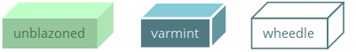
‘box’ style
The box style draws nodes as axonometric three-dimensional boxes.
Properties
- boxOrientation
- Type
- Enum
- Values
- topleft, topright, bottomleft, bottomright
- Default
- topright
Orientation of the three-dimensional depth of the box.
- boxDepth
- Type
- Number
- Values
- >0.0
- Default
- 20 * pow(0.7, depth)
The three-dimensional depth of the box.
- horizSideColor
- Type
- Color
- Default
- baseColor.lighten(0.34)
Color of the horizontal part of the three-dimensional depth of the box.
- vertSideColor
- Type
- Color
- Default
- baseColor.lighten(0.12)
Color of the vertical part of the three-dimensional depth of the box.
- strokeColor
- Type
- Color
- Default
- baseColor
Stroke color of the wireframe of the box. Back lines are not drawn.
‘line’ style
The line style is a special node shape style that draws a line below or above the node text so that it appears as a continuation of the line connecting the nodes.
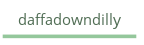
The following examples illustrate the use the line style:
TODO
Properties
None.
‘oval’ style
The oval style draws nodes as oval shapes.
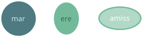
Properties
- aspectRatio
- Type
- Number
- Values
- >0.0
- Default
- 1.0
Initial aspect ratio of the oval (the ratio of the width and the height of the oval). Values less than 1.0 yield a vertically oriented oval shape, values greater than 1.0 a horizontally oriented oval, and 1.0 a circle.
- maxWidth
- Type
- Number
- Values
- >0.0
- Default
- 400.0
Maximum width the oval is allowed to reach without changing its aspect ratio. Once the width limit is reached, the aspect ratio is progressively decreased until the full node text fits into the node shape.
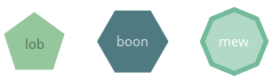
‘poly’ style
The poly style draws nodes as n-sided regular polygons (all sides have the same length and all angles are equal in measure).
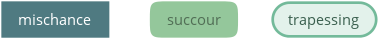
‘rect’ style
The rect style draws nodes as rectangular shapes that can be either completely square (first example) or can have rounded corners drawn in different rounding styles (last two examples).
Properties
- roundingStyle
- Type
- Enum
- Values
- screen, arc
- Default
- screen
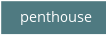
Controls the rounding style of the rectangle. screen results in a shape similar to an old CRT television screen, arc draws a rectangle with rounded corners using quarter circle arc segments.

screen

arc
- roundness
- Type
- Number
- Values
- 0.0–1.0
- Default
- 1.0
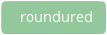
Rectangle roundess factor if roundingStyle is set to screen. A value of 0.0 yields completely square corners and 1.0 fully rounded ones.
roundness = 0
roundness = 0.5
roundness = 1.0
- cornerRadius
- Type
- Number
- Values
- >0.0
- Default
- 5.0
If roundingStyle is set to arc, the rectangle corners are drawn using quarter circle arcs having this radius (in points). The radius is capped at half the node’s height or width (whichever is lower) to prevent self-overlapping curves. This lends itself to a neat trick to draw capsule-like node shapes by setting the corner radius to a very large value (last example).
cornerRadius = 5

cornerRadius = 10

cornerRadius = 1000